Simple, unique and modern feel.
Transformative Journey
Incorporating Internal Family Systems (IFS) therapy principles to create a user-centered and empathetic experience.
Role
Product Designer (Research, Surveys, User Persona, Visual Identity, UX/UI, User Testing)
Team
CTO and IFS Therapist
Tools
Figma, MidJourney, Ballpark
Year
2023
Platform
Sentur


Sentur
Inspired by the IFS model, Sentur helps people on their journey to self-transformation providing them with daily IFS resources and community.
In recent years, mental health apps have gained significant popularity, offering accessible and convenient solutions for individuals seeking therapeutic support.
One popular therapeutic approach is Internal Family Systems (IFS) therapy. It combines systems thinking with the view that the mind is composed of multiple sub-personalities or Parts, each with its own unique qualities and functions. The goal of IFS therapy is to help individuals understand and harmonize these different parts, leading to a more integrated and balanced sense of self.
Why?
The app while rich in helpful IFS tools and resources, was impersonal, lacked a cohesive visual identity and didn’t evoke any emotion.
Evolving design trends highlighted the need for a more intuitive, visually appealing, and user-friendly interface. The goal was to create a home screen that not only welcomes users, but also guides them seamlessly through the therapeutic process.


Challenge
The home screen lacked calming, personalized, and intuitive experience, ensuring users felt understood and supported.
Understanding User Parts
Recognising different emotional states or "parts" of the users and understanding their needs, concerns, and desires within the context of the app.
Main Goal
Achieve recognisable, unique, simple and modern feel of the app while creating a visually appealing and calming atmosphere that not only welcomes users, but also guides them seamlessly through the therapeutic process.
Objectives
Make the brand recognisable
Giving the app simple, unique and modern feel.
Enhance User Engagement
Improve user engagement and emotional connection through visually pleasing and harmonious design elements.
Consistent Imagery
Redesign the images of the meditations and exercises to ensure consistency in style, tone, and emotional resonance.
Alignment with Therapeutic Goals
Ensure that the visual redesign resonates with the principles and goals of Internal Family Systems therapy.
Calming Colour Palette
Introduce a new colour scheme aimed at promoting relaxation, mindfulness, and emotional balance.
Enhance User Experience
Redesign the home screen to create an intuitive and enjoyable user experience.
Crafting connections
The main focus was on the style of images for meditations and exercises. They take a lot of space on the screen and attract the attention, so they had to be eye catching and making the brand recognisable.
I explored various visual styles that evoke tranquility and emotional resonance - experimenting with photos showing people and ones showing calming nature scenery as well as different styles of illustrations and more cartoonish style images.
Journey cards style
Experimenting with different card styles representing the user’s journey (daily goals).
Breaking Barriers
One of the goals was to make the brand recognisable, so…
• Using stock photos wasn’t going to work, because they are overused on other platforms.
• Choosing stock illustrations also didn’t work, because Sentur has huge library of meditations and exercises specifically for IFS therapy and it would be hard to find many images that correspond to the therapeutic approach in addition to evoke emotions and be personalised.
Generating images with AI.
With the help of AI I explored more styles and colour palettes, generating big amount of images in addition to being consistent in style.
Beyond Pixels
We conducted surveys with prototypes to gauge emotional responses to different visual styles and colour combinations as well as to understand user preferences, pain points, and expectations regarding the app's interface.
A couple of sets of surveys were conducted. In each of them people were asked to chose between 3 different styles of images - photos, colourful illustrations and purple tone illustrations.


Crafting Connections
Cultural Sensitivity
Considered cultural nuances and colour psychology to ensure the chosen colour palette was universally calming and emotionally evocative.
Iterative Design Process
Implemented an iterative design process, refining visual elements based on user feedback and emotional impact assessments.
Competitor Analysis
Analyzed the style and feel of other mental health and IFS apps to achieve a recognisable design.
Empathy in Pixels
Crafting a Compassionate Home Screen with IFS
Images
Adopting a consistent style of images, ensuring that these visuals resonated with the emotions targeted in each meditation and exercise. Also, focusing on conveying trustworthiness, being relatable by showing people and real life situations which make the users feel understood. Incorporated IFS symbols and metaphors into the design, ensuring visual cues resonated with users familiar with IFS concepts, fostering a sense of connection and understanding.
Colour Palette
Introduced a calming pastel tone colour palette featuring the main brand colour. Using only one colour for simplicity and consistency. Purple was chosen because of its association with calmness, relaxation, peace and emotional balance.
The Power of Transformation
Improved Emotional Connection
Users reported a stronger emotional connection to the meditation sessions due to the consistent and emotionally resonant imagery.

Enhanced User Engagement:
The calming color palette and visually cohesive design led to increased user engagement, with users spending more time exploring meditation sessions and other features of the app.
Positive User Feedback
Users liked the visually redesigned app, highlighting the calming effect of the new imagery and colors, which contributed significantly to their overall experience.

Harmony Restored
The redesign successfully transformed the home screen into a digital sanctuary, ensuring users felt heard, understood, and supported during their mental health journey. This project reinforced the importance of empathetic design; understanding the emotional needs of users is fundamental to creating impactful and supportive digital experiences.
The visual redesign of Sentur exemplifies the impact of thoughtful and cohesive design on user experience and engagement. By focusing on consistent meditation imagery and adopting a calming color palette, the app successfully created a visually harmonious environment. The journey of redesigning the Sentur’s home screen was not merely a technical endeavor; it is a profound commitment to the emotional well-being of the users.
More Projects
-
![A screenshot of a mental health app dashboard on a computer with a sidebar menu, displaying session updates, goals, challenges, key updates, skills, assessments, and progress in therapeutic concepts. On the left, a mobile phone screen shows a conversation with Sofia, an AI assistant, greeting Michael and asking about his feelings, with a text input field at the bottom.]()
Sentur Recovery
App | Dashboards | Brand Design | Social Media
-
![My Dictionary]()
My Dictionary
App | User Testing | Prototype
-
![Three smartphone screens displaying a mental health and self-care app interface. The screens show various features including a greeting message, journey plans, meditation courses, a network diagram of emotional states, and personalized content related to stress and internalized homophobia.]()
Sentur
App | Research | Brand
-
![Screenshots of a mobile healthcare app showing a doctor search page, appointment scheduling, and a doctor profile for Dr. Maria Ivanova, a heart surgeon.]()
DocFind
App | Research | Prototype
-
![Screenshots of an online banking app in Bulgarian, showing options for withdrawal, deposit, changing PIN, balance inquiry, and others; includes PIN entry, deposit confirmation, and transaction amount input screens.]()
EasyPay
ATM | Animations | Research
-
![Three smartphones displaying different screens of social media and branding content for Sentur, a healthcare company, with a central woman jumping outdoors and text that says "Tailor your approach to each individual's needs."]()
Sentur Recovery Brand
Brand Design | Social Media
-
![Four smartphone screens showing a music or event app interface including login, genre selection, search results with images of concerts, and event details with location map.]()
ConcertHub
App | Research | Prototype
-
![Laptop and smartphone screens displaying Coca-Cola promotional websites, featuring contests, recipes, and product images in a red, black, and white theme.]()
Coke & Meals
App | Web Design | Promo Engine
-
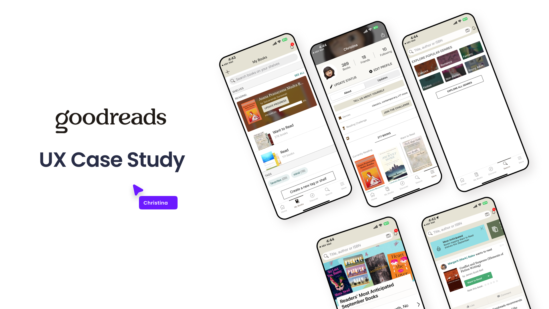
![Graphic showing a UX case study presentation for Goodreads, including multiple mobile phone screens displaying different views of the Goodreads app interface, with a title and a label indicating it's a UX case study.]()
Goodreads
Case Study | UX | Research | Wireframes
-
![]()
Hiker
Bulgarian Hiking App
-
![]()
Conversion Landing Page
Redesign | Research | Web & App